The Next Revolution?

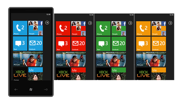
And now it was official… Windows Mobile is no more! As you can see from the images above, Windows Phone 7 has done away with its past, but along with that, it has distanced itself from its competitors by avoiding the familiar conventions of colourful icons in grid layouts, background textures like shiny plastic and metallic chrome, in favour of a typographic, and information focused interface, where colour is used to highlight important text, rather than to brand your application or to look pretty.

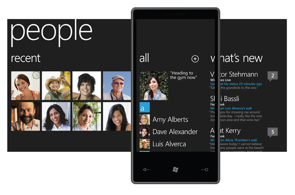
Along with changing the look of the mobile OS, Microsoft has also changed the way you navigate and use the OS. The concept of discreet applications you dip in and out of to perform specific tasks, has given way to a live approach to your content, and an integrated approach to what you do with your contacts, and media.

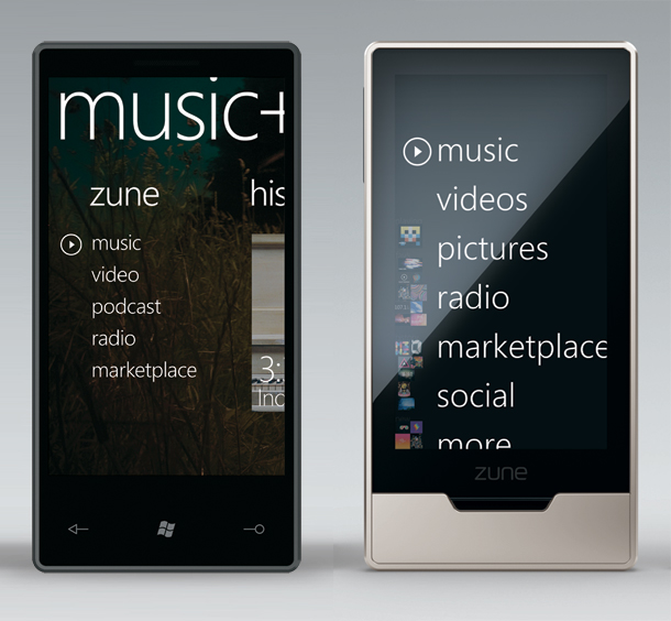
I am not going to explain how you use it, or go into the technical side to it, I am a designer, and I focus on the aesthetics, there are plenty of hands on reviews out there if you are interested in that part of it. But I felt the need to comment on it, because this interface isn’t as unusual as you may think, and follows a trend that Microsoft has been moving through since the development of Windows Media Centre, and the Zune.
The similarities are obvious at first glance, and as I ditched my iPod in favour of a Zune HD – a device which hasn’t officially been launched outside of the US – I am very comfortable and pleased Microsoft has taken this approach, as I am a fan of minimalist typographic design, and eliminates the problems I have with these other smart phones, in that the size of the icons and elements you touch seem too small for me, even more so compared to the large text and boxes on the Zune HD.
Anyway, I have rambled on too much here, this comment has become an essay! I just wanted to say how thankful I am to Microsoft for daring to be different, and taking this huge risk in taking a fledgling market in mobile devices, and re-defining it rather than iterating the ideas from the iPhone, and before that, the desktop OS philosophy. Smart Phones are not PCs, so why should they try to act like them.

