After the surprisingly statistic-light reveal of Microsoft’s brand new Windows Phone 7 Series OS at the Mobile World Congress in Barcelona yesterday, I have spent time playing with my Zune HD, toying with my brother’s iPhone, and looking at images of Google’s Android UI. What strikes me is how Microsoft has taken a very unique and unusual approach to a Smart Phone user experience, than that of the competitors, whilst still doing basically the same tasks.

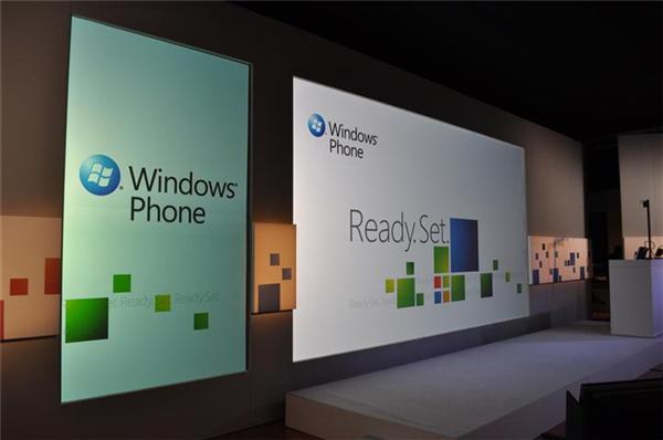
Photo by Tom Warren of Neowin.net
The Revolution Came
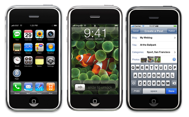
When the iPhone launched, it was a revolution in not only how you use Smart Phones, but also on what people expect to do with these devices. The UI – whilst unusual for a mobile device – brought with it the usual visual language we have been using on desktop PCs for many years – such as icons, pop-up balloons, and grid layouts – so apart from the touch gestures replacing mouse navigation, the whole experience was familiar and easy to grasp.

Apple took the approach of taking the types of activities average PC users had been doing, and condensing it with a focused intensity, removing superfluous functions like running multiple applications at one time, and command lists such as menus and large toolbars. They found an on-screen layout which was clear to understand and control, at the expense of ‘one size fits all’ programs.
The iPhone quickly grew from the closed device which did a few things well, to a platform for developers to offer experiences and small functions which would enhance your daily life. This struck a chord with the public, and the device spread very quickly, forever re-defining what mobile devices should be capable of, and with it led rivals to try to emulate that same formula.

