If you have had any experience in the print and DTP industry, there are two names you have to know, Adobe and Quark.

Adobe (who have now engulfed the third daddy, Macromedia) have settled in all sections of the design and graphics industry, but Quark are primarily print.
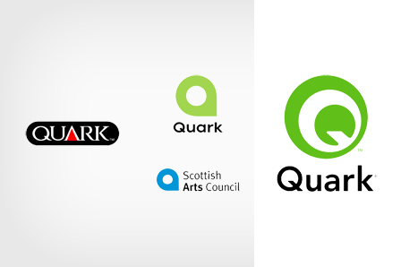
In 2005, Quark announced they were re-branding with a new modern logotype, aiming to show their modernity. The media got all excited, one of the leaders of the print and graphics industry, taking on a new look.
Well the press got more than they bargained for…
The logo, was shown and was welcomed warmly, that is for a day or so.
Outcry flew through the internet, calling it a rip-off, citing many well known companies with almost identical logo designs. The closest being the Scottish Arts Council.
At first Quark denied they had ripped off any logos, and defended the work of the designers who had created the new look. But it was clear, that their public image was at risk, and so, in 2006, a new new logo was announced.
Personally I am a fan of the new logo, and liked the previous, in all its various forms ;). Quark responded to this gaff, and whilst the memory of the Quark Logo oopsie will linger, I don’t think it’s reputation has been completely tarnished.
Now if we are talking about the UK Royal Mail and Consignia disaster…

