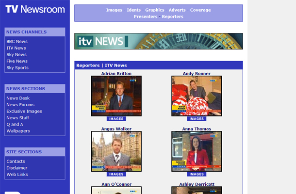
Starting out as a fan site dedicated to the UK 24 hour news channel, Sky News, it was an uncomfortable letter from Sky, concerned that the site may have been getting confused with the channel’s own website, which led to the decision to rename the site and branch it off into covering all UK domestic – and some international – news broadcasts.

In August 2005 TV Newsroom was launched and has remained a quirky and important site for anyone interested in the operation and presentation of news on television. With exclusive images of reporters covering live events, as well as Q&A’s with popular newscasters, TV Newsroom offers a unique group of content for its visitors.

In August 2006 we began discussing giving the site an updated look but the big changes didn’t arrive until January 2007, with the advent of CSS and XHTML and the way they influenced web design.

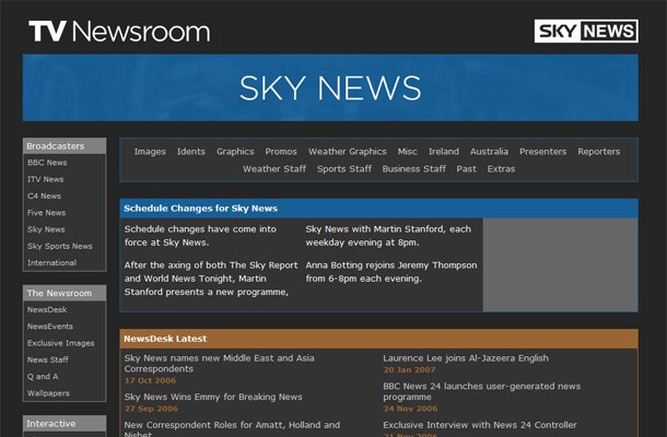
The then refreshed – but still – table driven website (yes I know how bad were those!), was in need of a ruddy good shake up. So having worked together for some time, the site’s owner Johnnie Larkin approached me once again, wanting to see some proposals for a new design which was fresh and modern, but worked with the same content and layout as was being used.

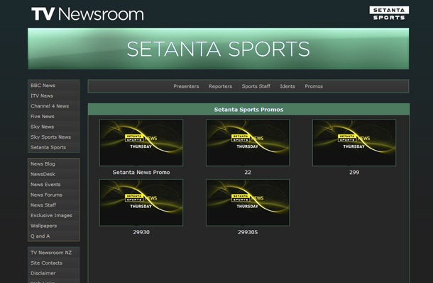
This design was sympathetic with what had come before, but was given a darker and more striking design, which had its roots in big bold headlines as you would find in the red-top tabloid newspapers.

