I have to be honest here, I have never been into a next store, nor have I purchased anything from them. But I did take notice when a few people online were discussing the changes.

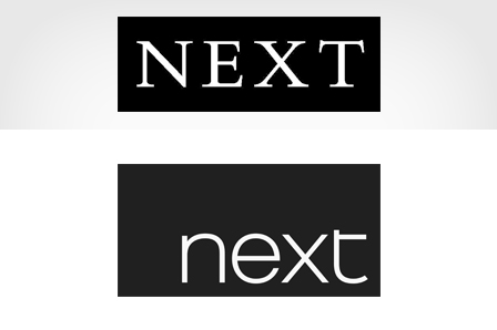
I had seen their logo on the high street, but it always felt a little old fashioned. The all capitals, serif font, always seemed a but unapproachable.
But in comes a new typeface for the high street shops, and that’s about it. but even a small alteration, can do wonders. Simple clean, large x-height font, with subtle curves and flicks.
It won’t be persuading me to shop there, but perhaps for those interested in clothes and that sort of stuff, may give it a second glance. Another example of an older brand, refreshing successfully IMO.

